 Somewhere/time (cryptically cosmic, huh?) between Star Trek/Planet of the Apes and Logan's Run/Star Wars (1975 to be exact), there was Space: 1999, the syndicated British series that kept sci-fi space opera on the tube during what Ol' Groove likes to refer to as "The Lull". There are tons of sites, like this one, dedicated to the show, so if you wanna learn more about it, remember that Google can be your friend. I think the series' intro does as good a job of fillin' ya in on the series and its stars as anything, myself. Check it out!
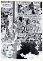
Anyway, the main thing I want ya to know about is that Charlton Comics produced 8 issues (November, 1975-October, 1976) of a spiffy b&w Space: 1999 mag during the show's heyday . Space: 1999 sported some magnificent art by folks like groovy Gray Morrow. Don't believe me? Then check out this sensational strip, scripted by the ever-talented Nick Cuti, from ish #1 called..."Endgame!"


You just keep the great stuff coming. Thanks. I have a technical question for you Groovy Agent. How do you make your thumbnails line up horizontally like that? I have killed myself trying to do it. Is it the theme you use? Did you attach some code to your HTML box? All I can do is stack stuff vertically, as can only most Bloggers. Did you learn this from Reed Richards?
ReplyDeletecan you send me a mail to: uranium.cafe@yahoo.com
I have really tried to do this for a long time.
Bill
I don't mind sharing my "trick" with the world, Willy--after all, if Mr. Fantastic was nice enough to show me...
ReplyDeleteI think the main trick is in the pic upload settings. Set your image size to "small" and layout on "none". This allows you to get three or four thumbs in a row, per line, depending on your page template.
The next part of the trick involves lots of patience, 'cause Blogger keeps throwing ya curve balls, like adding lots of line breaks in random spots (between pics, between paragraphs--oh, the misery!)on your blog entry between each upload. This causes you to have to re-align all your pics (pretty much every time you upload a new one), and delete whatever line breaks that show up. After a half-hour or so of uploading, battling line breaks, and re-aligning, viola! You've got your stacked thumbs.
Simple, huh?
;D Hope that helps. If you need more help, just ask, and I'll do my best to serve.
That Morrow art is beautiful. He was one of the more underrated artists of that time. The mag was much better than the show!
ReplyDeleteThanks for the Google wrangling tip!
ReplyDeleteWhen it comes to Space: 1999 I've no choice but to admit I was a fan. The comics version actually suffered a bit for being too sane and rational in comparison with the television show. if anything, you think of comics as the medium where a creative vision can really go wild and do all the things a special effects budget wouldn't allow, but in the case of this series it was the small screen version that made its stories feel more hallucinatory and dreamlike.
That said, I remember this particular comic for introducing me to the work of both Cuti and Morrow -- and it was precious enough that I still vividly remember the disappointment when my copy got lost. Thanks for this reunion with yet another childhood treasure!