 |
| Cover art by Ken Barr |
Wednesday, September 16, 2015
Team-up Week! Black and White Wednesday: "And Then...The X-Men!" by Moench, Simonson, and Alcala
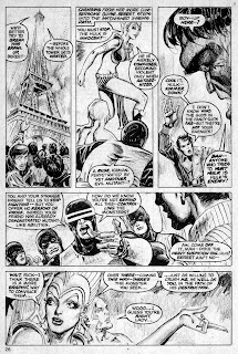
Welcome back to Team-Up Week! Check it out, Groove-ophiles! Not only do we get another chapter of the truly-far-out Doug Moench/Walt Simonson/Alfredo Alcala Rampaging Hulk saga (from RH #2, January 1977), but this one includes more aliens, a giant robot (or is it?), and the original X-Men! Dig it, the "first" meeting of Ol' Jade Jaws and the Children of the Atom--at least until the series was ret-conned out of existence. Sigh... Anywho, Moench's story is loads of fun (The Hulk in Europe!), Simonson's layouts are very strong and powerful, and Alcala's inks (or is that charcoal?) are outtasite! Why are you still reading Ol' Groove's ramblings (or are you)? We'll travel back to 1962/63 via 1977, hook up with Greenskin and Rick..."And Then...The X-Men!"
Subscribe to:
Post Comments (Atom)
Special thanks to Mike's Amazing World of Comics and Grand Comics Database for being such fantastic resources for covers, dates, creator info, etc. Thou art treasures true!
Note to "The Man": All images are presumed copyright by the respective copyright holders and are presented here as fair use under applicable laws, man! If you hold the copyright to a work I've posted and would like me to remove it, just drop me an e-mail and it's gone, baby, gone.
All other commentary and insanity copyright GroovyAge, Ltd.
As for the rest of ya, the purpose of this blog is to (re)introduce you to the great comics of the 1970s. If you like what you see, do what I do--go to a comics shop, bookstore, e-Bay or whatever and BUY YOUR OWN!


That's ink and grease pencil. which resembles crayons. Used skillfully on a textured board, it gave the effect of charcoal and also photographed more easily without halftone screening, back when that was an issue. Joe Kubert was a real master of grease pencil, as can be seen in Firehair, among others.
ReplyDeleteIt seemed that there was a month or so about that time when most of Alfredo's output featured this ink/grease pencil style change and then, back to "normal."
DeleteCompletely missed out on Rampaging Hulk back in the day - I didn't even know it existed until the dawn of the internet! But seeing scans like this really makes me want to go out and at least track down the Essentials reprints.
ReplyDeleteIt's absolutely fascinating seeing Simonson's layouts inked (or indeed, perhaps charcoaled) by Alcala. I still prefer Simonson doing the complete art, but this still looks really cool. As always, thanks for posting this, Groove!
Try to get the original magazine publications instead of the Essentials. The image quality suffers when they shrink the art down for the Essentials.
DeleteAnd also, the Essentials are in b&w, which loses the beautiful 'Marvel-Color!' from the issues of The Hulk! that are also included in the edition.
DeleteBeautiful artwork. Although I own this issue I'd forgotten Alcala employed such a special inking technique over Simonson's powerful pencils (it sure looked like Walt was enjoying himself on this series). I like this earlier version of the X-Men appearing simultaneously with the Claremont/Cockrum one that was being published at the time. Marvel probably figured this appearance in the Hulk's mag would lead more readers toward what would soon become their best-selling title.
ReplyDeleteRampaging Hulk was probably the best representation of the character, ever. What a great book. (What a great time to love comics!) Alcala really did have something special, didn't he?
ReplyDeleteThis Moench-written series has been praised many times for the shoe-horn continuity, but as a letter writer commented in a later issue, it was very sloppy and got the continuity wrong. That bothered me in the day, but I could care less now because a good story is a good story, regardless.
ReplyDelete