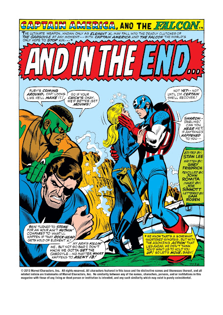
Ya know, Groove-ophiles, for a short time in 1971, John Romita was reunited with a character he'd drawn back in the mid-1950s: Captain America. The Jazzy One's style had changed quite a bit, and the times had certainly changed, but Cap and Romita still made a great fit. Ol' Groove should also mention that Romita's take on Cap made for a nice bridge from the Gene Colan era to the long-running Sal Buscema era of CA&F (and a few issues had dynamite inks by Joe Sinnott, to boot). Just dig these splashes from Captain America and the Falcon issues 138-144 (March-September 1971) and see for yourself!
Subscribe to:
Post Comments (Atom)
Special thanks to Mike's Amazing World of Comics and Grand Comics Database for being such fantastic resources for covers, dates, creator info, etc. Thou art treasures true!
Note to "The Man": All images are presumed copyright by the respective copyright holders and are presented here as fair use under applicable laws, man! If you hold the copyright to a work I've posted and would like me to remove it, just drop me an e-mail and it's gone, baby, gone.
All other commentary and insanity copyright GroovyAge, Ltd.
As for the rest of ya, the purpose of this blog is to (re)introduce you to the great comics of the 1970s. If you like what you see, do what I do--go to a comics shop, bookstore, e-Bay or whatever and BUY YOUR OWN!


Great pages!
ReplyDeleteI notice a few of these are from that weird period when Marvel decided to dispense with any punctuation that wasn't a question mark or an exclamation point.
They had been overdoing the exclamation points (yes, I would like some pancakes!!!) for a while and decided to cut back on the inking costs by eliminating most of the periods, but somehow it didn't really work from an aesthetic standpoint.
That's my theory, anyway.
I mean, you've gotta end a sentence somehow
Otherwise people aren't going to know if it's finished or not
M.P.
Yeah, they learned that if they didn't have the exclamation points, many times, as you noticed, the printing would drop the period completely, leaving no end punctuation. No wonder teachers gave Li'l Groove a hard time over his comics back then!
DeleteJohn Romita's time on Captain America was brief but memorable. It was good to see him on something other than Spider-Man for awhile. However, he could never escape the inexorable pull of webhead for very long until his art director duties caused him to drop out of the monthly comics output for good. It's too bad deadlines kept him from inking himself all the time as 100% Romita was the best Romita.
ReplyDeleteI entered comics at 11 years old at exactly this time frame, Thus JR is my reference point for Cap, lol. Great stories! By the way, something else freaky was going on with Marvel: there were color ads for women's lingerie in some of these issues! Honestly!
ReplyDeleteI'm going to have to revisit some of my copies...
ReplyDeleteM.P.
Hello, sorry to gripe because I love your site and all the work you put into it but I wish you would have used scans from the original comics. The newsprint looks so much better.
ReplyDeleteMan, I've just been reading this series, and after the very lackluster art for long stretches, Romita was even more impressive!
ReplyDelete